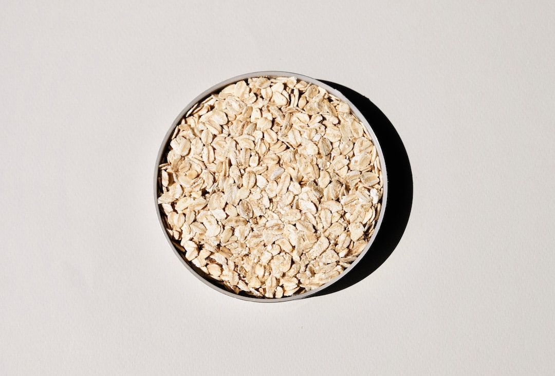
Plain oatmeal. That's why your labour of love website is falling flat on its face –– because your landing page is as boring as plain ol' oatmeal.
If your goal is to grab customers' emails and their credit card details then you need to stop focusing on everything else BUT your landing page design.
Before I give you the secret formula, let me explain what a landing page is.
Think of it like a shop window. The goal of any landing page is to grab the visitor's attention as quickly as possible.
If done right, a well-designed landing page will benefit your business day and night –– bringing in emails, leads and sales.
Done wrong, well like Willy Wonka said to Charlie "You Get Nothing! You Lose! Good Day, Sir!"
Got it? Good. Let me explain how you can create a solid landing page for your customers.
People skim. I would be surprised if you read all the way to this sentence without first quickly skimming the whole article. We have habits. When we see an article we skim it to see something that grabs our attention. Our digital devices have given us the attention span of a goldfish with Alzheimer's.
The most important aspect of your landing page is to grab your visitor's attention straightaway.
This brings me nicely to my secret formula for creating the most epic landing page ever –– the AIDA model: Attention, Interest, Desire and Action.
This model outlines the customer's decision-making process that we all go through when making a purchase or sharing our emails.
To help you visually understand the AIDA model and how it can be applied to your landing page, I am going to share a top-notch landing page that ticks all the boxes and then some.
For this example I will be focusing on Slack –– it is a banger of a landing page. Let's jump in.
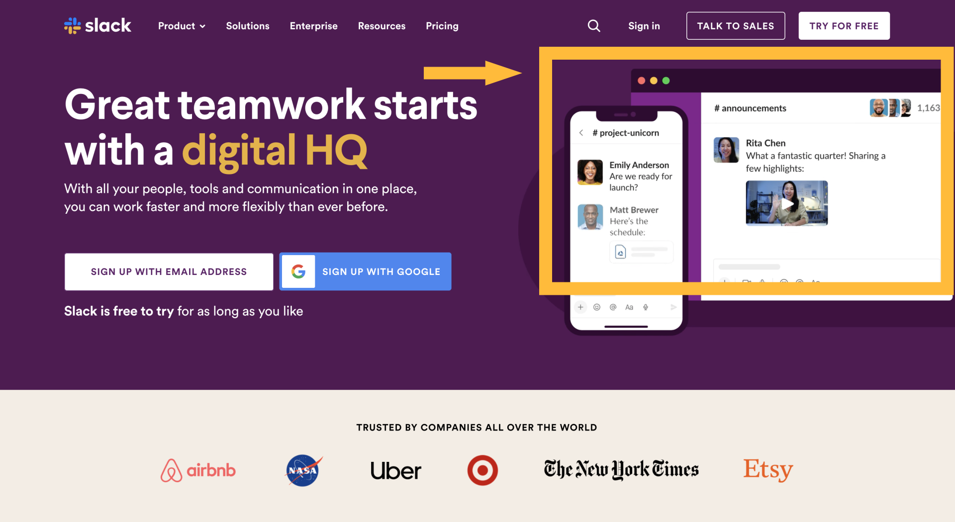
Right off the bat, Slack grabs your attention with a header video. Just right of the main header copy the video gives you a flavour of Slacks products both on mobile & desktop. The highlighted copy "digital HQ" also grabs my attention and helps me understand what Slack does.
Your header section is the first impression for your visitor. This is where you should spend the most amount of your time when designing your landing page. Don't just want to grab your visitor's attention ––– steal it.
Another great way to grab your attention –– Below the header section Slack has also included some of the companies' logos that use their product. If it's good enough for NASA well it's good enough for me.
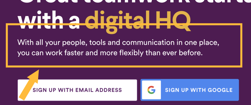
Slack immediately grabs your interest by telling you the benefits to your business –– "With all your people, tools and communication in one place, you can work faster and more flexibly than ever before."
In today's post-COVID world, two words that interest most companies are speed and flexibility. Those words are what turn visitors' attention into interest and why they will continue to scroll.
When trying to write copy for your own landing page, remember this...
Speak to your customer –– make them feel like they are the only person you are talking to. People don't buy the product, they buy the benefits –– so talk about them.
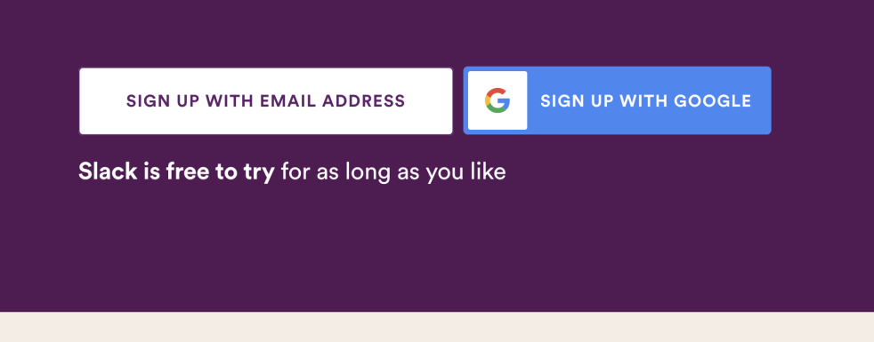
Slack merged both desire and action. The copy –– "Slack is free to try for as long as you like" This short sentence creates a desire for me to take action. Customers love free, try before you buy. It's like taking a car for a spin before you buy.
Above that copy, there are two highly effective 'Call-to-actions'. All you gotta do now is enter your email and you're off to the races. The entire AIDA model is in the header section of Slacks landing page. Sure you can keep scrolling and people do (goldfish attention), but Slack has continued the AIDA model throughout its landing page in preparation for this.
When designing your landing page, always be thinking about how you can include the AIDA formula. How can you grab your visitor's attention?
Then once you do that, how can you say or visually show something interesting that your visitor will want to continue scrolling.
Even if you achieved all of the above...how can you now create a strong desire that your visitor will take action and give you over their email or better their hard-earned dolla dolla.
Remember above all else –– Speak to your customer –– make them feel like they are the only person you are talking to. People don't buy the product, they buy the benefits –– so talk about them.
You got this,
– Dave